
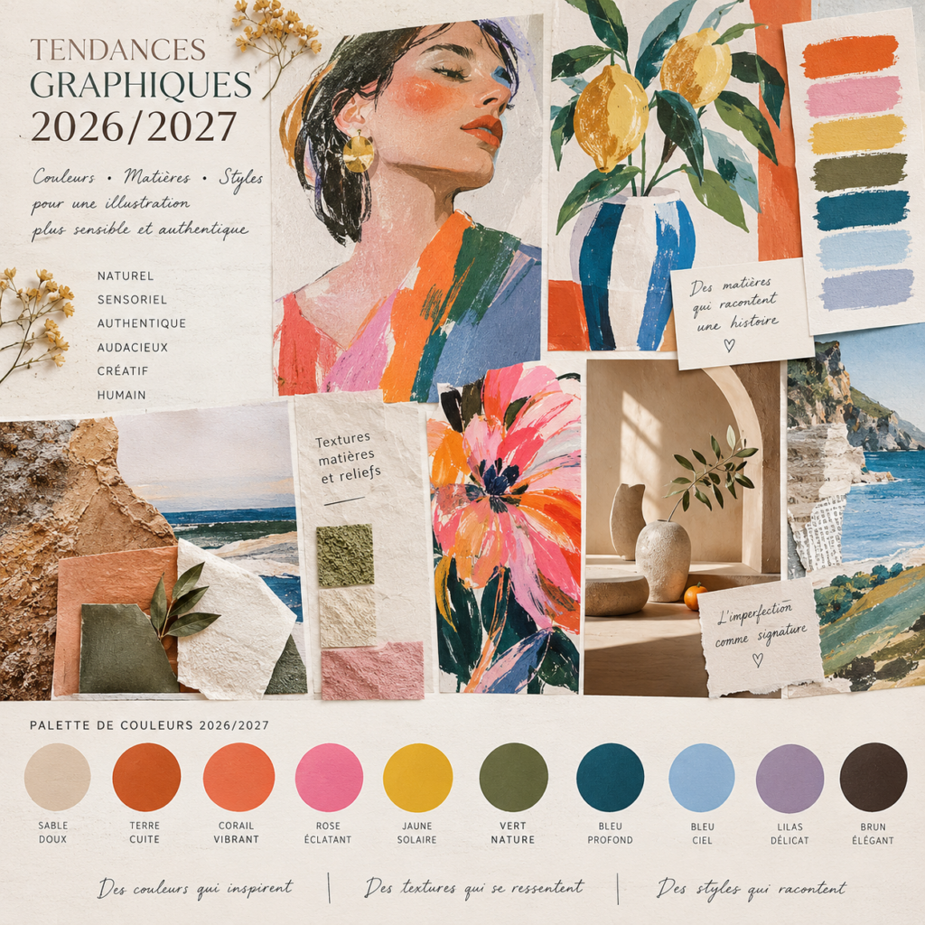
colors, materials and styles that inspire commercial illustration
Introduction: Following trends without losing creativity
When working in commercial illustration and sometimes involved in art direction, it’s difficult to ignore new visual trends. The dominant colors, eye-catching materials, emerging graphic styles, and new aesthetic combinations inevitably influence how we design images, brand identities, and communication materials.
Whether you work for a cosmetics brand, a luxury house, a publisher, a decoration brand or a lifestyle company, understanding trends allows you to imagine creations in line with their time and the expectations of their audience.
But does that mean we should follow every trend of the moment? I don’t think so.
For me, creative monitoring is first and foremost a source of inspiration. It allows me to observe, understand, enrich my research and open up new avenues, without necessarily reproducing what I see everywhere.
In 2026, one question particularly interests me: How to appropriate graphic trends while retaining a true artistic singularity?
Colors, textures, illustration, typography, artificial intelligence and art direction: let’s explore the major visual influences of the year and how they can enrich our commercial projects.
1. Major graphic design trends for 2026
The return of materials and sensory textures
We live in a world where digital images are ubiquitous. In response, creations that suggest a material, a sensation, or a physical experience are taking center stage in the creative trends of 2026.
The grain of the paper, the brushstrokes, the granular surfaces, the relief effects, the transparencies and the almost tactile textures bring depth to the images.
This search for material can be found both in digital compositions and in universes inspired by traditional techniques: painting, engraving, collage, artisanal printing or hand drawing.
How can it be used in commercial illustration?
In the world of cosmetics, for example, an illustration with soft, enveloping textures can evoke the sensory experience of a skincare product. For a home decor brand, effects of paper, earth, or raw materials can reinforce a natural and artisanal dimension. In the food sector, textures can suggest the indulgence, freshness, or authenticity of a product.
The goal is not to add texture everywhere, but to choose the one that tells a relevant story about the brand.
Embracing imperfection and the return of human gesture
In 2026, several creative trends value a less polished, less standardized aesthetic, more marked by human intervention.
Irregular lines, spontaneous forms, handwritten script, visible collages, superimpositions and small imperfections become graphic choices in their own right.
This approach does not mean that the work should be neglected. On the contrary, imperfection is interesting when it is intentional and contributes to the visual identity.
In commercial illustration, a drawing done in pastel, a line that retains its natural movement or a composition that reveals the material can give a brand a warmer and more accessible personality.
It is also a way to create a contrast with the very smooth and uniform visuals found in digital environments.
Surrealism and unexpected associations
Surrealism continues to offer a particularly rich playground for illustrators and art directors.
In 2026, dreamlike universes, exaggerated proportions, unusual associations and slightly absurd situations contribute to a search for surprise and emotion.
A giant flower, an object repurposed from its original function, a composition that blends several worlds, or an impossible scene can create an immediately memorable visual.
For a brand, this language makes it possible to break away from usual representations and build a distinctive visual territory.
However, it is important to find the right balance between creativity and readability: a surprising image must always serve the message, the product or the story that the brand wants to tell.
Expressive compositions, collage and layering
Perfectly ordered layouts are no longer the only things that attract attention. Freer compositions, overlapping elements, combinations of photographs and drawings, and cut-out effects offer new narrative possibilities.
This approach draws inspiration from publishing, posters, creative notebooks, and artisanal practices.
In commercial illustration, it can add rhythm to a campaign, enrich packaging, or give more personality to social media communication.
Collage is particularly interesting when it allows for the merging of disparate elements around a common idea. It then becomes a tool for artistic direction, and not simply a decorative effect.
The contrast between vibrant colors and natural palettes
The color trends of 2026 are not limited to a single palette. Several sensibilities coexist: bold and saturated colors to create an immediate impact, but also earthy tones, soft shades, and more subtle combinations.
Bright colors can support an optimistic, playful, or bold atmosphere. Natural hues, on the other hand, can evoke texture, vegetation, authenticity, or well-being.
What I find particularly interesting is the possibility of combining them: a mineral background enhanced by an intense color, a plant palette accompanied by an unexpected accent, or powdery shades contrasted by a deep tone.
In art direction, the choice of colors should never be isolated from the rest of the project. It depends on the brand’s positioning, its target audience, its sector, and the emotion one wishes to evoke.
A trendy color is only relevant if it serves the world one is trying to build.
2. What are the trends in commercial illustration?
Trends only truly come into their own when translated into concrete choices for a project. Commercial illustration allows us to interpret them rather than simply applying them mechanically.
Illustration and packaging: creating a visual experience
Packaging is a particularly interesting area for exploring graphic trends. It must attract attention, convey a brand’s values, and stand out in a competitive environment.
An original illustration can bring a narrative dimension to the product, strengthen its identity, or create an emotional connection with the consumer.
For a beauty brand, organic shapes and delicate textures might be preferred. For a lifestyle product, a more expressive, colorful, or unconventional aesthetic could be appropriate.
The key is to build consistency between the illustration, the colours, the typography, the printing materials and the commercial positioning.
Editorial illustration and brand communication
In publishing, the press, blog articles and communication materials, illustration makes it possible to give an identity to a subject and to express an idea that is sometimes difficult to convey solely through photography.
Hand-drawn styles, visual metaphors, narrative compositions, and unexpected associations can enrich content while enhancing its memorability.
A graphic trend then becomes a way of interpreting a subject with a unique perspective, rather than simply an aesthetic embellishment.
Art direction: building a coherent universe
Art direction isn’t just about choosing a pretty color palette or a trendy illustration style. It involves giving direction to all the visual elements of a project.
Colors, typography, images, textures, compositions, media and uses must interact with each other.
A trend can serve as a starting point for a mood board, fuel a search for references, or open up a creative avenue. But it must then be adapted to the needs of the project and the constraints of the brand.
It is this interpretation that allows us to move from a simple inspiration to a true artistic proposition.
3. Artificial intelligence and creativity: finding the right balance
Artificial intelligence is transforming visual research and production methods. In particular, it allows for the rapid exploration of atmospheres, the testing of color combinations, and the multiplication of approaches during a design phase.
But the ease with which images can be generated does not guarantee their relevance or originality.
When working in commercial illustration or art direction, it remains essential to define an intention, understand the brand context, and make consistent choices.
AI can contribute to creative research, but it does not replace critical thinking, artistic sensitivity, and the ability to construct an identifiable visual language.
In my view, the question is therefore not about choosing between digital tools and traditional techniques. It is rather about knowing how to use them intelligently, without losing what makes a creation recognizable.
Drawing, painting, pastel, collage or textures made by hand can also enrich a digital composition and give it a unique dimension.
4. How to use trends without becoming interchangeable?
Creative monitoring is essential to stay attuned to evolving styles and practices. However, it can also become a trap when the same visual codes are systematically reproduced.
To avoid this pitfall, I favour a four-step approach.
Observer. Identify the colours, materials, styles and compositions that emerge in different sectors, without limiting oneself to one’s own field of activity.
To understand. Look for what explains their success: a cultural evolution, a new expectation from the public, a reaction to visual saturation or a need for proximity with brands.
Interpret. Select the elements that make sense for the project and adapt them to its identity, message and target audience.
Experiment. Testing less obvious associations, mixing techniques and accepting to move away from initial references in order to bring forth a personal proposal.
This final step is, in my opinion, essential. It allows us to transform an observed trend into artistic research rather than a simple reproduction.
Conclusion: What if the next trend came from you?
Observing graphic trends for 2026 is a way to understand the visual world we live in. Sensory materials, imperfect gestures, expressive compositions, surreal universes, and color contrasts offer numerous avenues for renewing commercial illustration and enriching art direction.
But knowing the trends does not mean having to follow them at all costs.
Sometimes, it is precisely by stepping outside the norm that something new emerges.
An unexpected combination of colours, a technique diverted from its usual use, an unexpected mix of materials or a personal way of representing a subject can open up an original path.
What seems unusual, even surprising, today can become a source of inspiration for others tomorrow. It’s impossible to guarantee that an idea will be the first or that it will launch a trend, but it is possible to cultivate this ability to see things differently and to dare to make choices that aren’t yet commonplace.
For me, true creativity is not about reproducing what already works. It’s about understanding the rules, knowing when to use them, and sometimes having enough confidence to break free from them.
Trends can inform our vision, but they should never replace our imagination.
And you, do you prefer to be inspired by current trends or explore more personal directions, even if it means going off the beaten track?